Chapter 4 PDP and Causal Interpretation
Author: Thommy Dassen
Supervisor: Gunnar König
4.1 Introduction
Machine learning methods excel at learning associations between features and the target. The supervised machine learning model estimates \(Y\) using the information provided in the feature set \(X\). Partial dependence plots (PDPs) allow us to inspect the learned model. We can analyze how the model prediction changes given changes in the features.
The unexperienced user may be tempted to transfer this insight about the model into an insight in the real world. If our model's prediction changes given a change on some feature \(X_j\), can we change the target variable \(Y\) in the real world by performing an intervention on \(X_j\)?
Of course, this is not generally true. Without further assumptions we cannot interpret PDPs causally (like we cannot interpret coefficients of linear models causally). Curiously, certain assumption sets still allow for a causal interpretation.
In this Chapter we will elaborate on specific assumptions sets that allow causal interpretation and will empirically evaluate the resulting plots. We therefore assume certain data generating mechanisms, also referred to as structural equation models (SEMs), and use Judea Pearl's do-calculas framework to compute the true distributions under an intervention, allowing to e.g. compute the average causal effect. Graphs are used to visualize the underlying dependence structure. We will see scenarios in which the PDP gives the same result as an intervention and scenarios in which the limitations of the PDP as a tool for causal interpretation become clear.
To interpret causally means to interpret one state (the effect) to be the result of another (the cause), with the cause being (partly) responsible for the effect, and the effect being partially dependent on the cause. (Zhao and Hastie 2018) formulated three elements that are needed to ensure that the PDP coincides with the intervention effect:
1. A good predictive model which closely approximates the real relationship.
2. Domain knowledge to ensure the causal structure makes sense and the backdoor criterion, explained below, is met.
3. A visualization tool like a PDP (or an Individual Conditional Expectation plot)
The first condition is an important one, because there is a big difference between being able to causally interpret an effect for the model and using it as a causal interpretation for the real world. The second condition will make clear when PDPs are the same, and when they are different from interventions on the data. In this chapter we will systematically analyze a number of scenarios in order to see under which conditions PDPs can be causally interpreted or not.
4.2 Motivation
Before we have a look at various scenarios and settings involving interventions, let's look at an exemplary problem. Let's say we have a dataset containing data on the amount of ice-cream consumption per capita and the temperature outside. The temperature is causal for the ice-cream consupmtion: People eat more ice-cream when temperatures are high than when temperatures are low. Therefore, both quantities are dependent as well. A statistical model learns to use the information in one of the variables to predict the other, as is evident in the plots below.
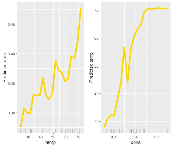
FIGURE 4.1: The PDP on the left shows temperature causing ice-cream consumption. The PDP on the right shows ice-cream consumption causing temperatures. Which one is correct?
While the dependence is learned correctly, it would be wrong to interpret the second plot causally. When more ice cream is consumed, it is likely that the temperature is higher. However, consuming more ice cream will not change the amount of ice cream that is being eaten.
This example illustrates the gap between predictive models and causal models. Without further assumptions we cannot interpret effects of changes in features on the model prediction as effects that would be present in the real world. In this simple scenario it is quite clear in which cases a causal interpretation is clear. However, in more complicated scenarios a more elaborate formalization of assumptions under which a causal interpretation is possible are helpful. We will analyze this theoretically in the next section and will empirically evaluate the theoretical findings.
It may be noted that other problems can occur when using PDPs for model interpretation. E.g. as shown by (Scholbeck 2018), assume we have data that is distributed as follows:
\[ Y \leftarrow X_{1}^2 - 15X_{1}X_2 + \epsilon \] \[ X_1 \sim \mathcal{U}(-1, 1), \ \ \ \ \ X_2 \sim \mathcal{U}(-1, 1), \ \ \ \ \ \epsilon \sim \mathcal{N}(0,0.1), \ \ \ \ \ N \leftarrow 1000 \] Training a Random Fordest on this data leads to Figure 4.2 below. Looking at the PDP, one would assume that \(X_1\) has virtually no impact on \(Y\). The ICE curves, however, show that the averaging effect of the PDP completely obfuscates the true effect, which is highly positive for some observations while being highly negative for others. In this example too it would be misguided to simply interpret the PDP causally and state that \(X_1\) does not have any impact on \(Y\) whatsoever. This may capture the average effect correctly, but evidently not true on the individual level.
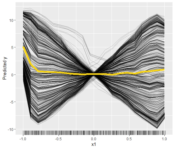
FIGURE 4.2: The average effect of the PDP (yellow line) hides the heterogeneity of the individual effects
4.3 Causal Interpretability: Interventions and Directed Acyclical Graphs
For the rest of the Chapter we will assume we know the structure of the mechanisms are underlying our dataset to derive assumptions under which a causal interpretation is possible. With the help of Pearl's do-calculus (Pearl 1993) we can compute the true causal effect of interventions. Pearls do-calculus relies on an underlying Structural Equation Model, the structure of which can be visualized with causal graphs. In the structural equation model this is equivalent to removing all incoming dependencies for the intervened variable and fixing a specified value. As an effect, the distributions of variables that are caused by the intervened variable may change as well. For more details refer to (Pearl 1993). It is important to recognize that an intervention is different from conditioning on a variable. Therefore the difference between a variable \(X\) taking a value \(x\) naturally and having a fixed value \(X=x\) is reflected in the notation. The latter is denoted by \(do(X=x)\). As such, \(P(Y=y|X=x)\) is the probability that \(Y=y\) conditional on \(X=x\). \(P(Y=y|do(X=x))\) is then the population distribution of \(Y\) if the value of \(X\) was fixed at \(x\) for the entire population.
In order to avoid complex scenarios (dynamical models, equilibrium computation) we restrict ourselves to causal structures that can be visualized with Direct Acyclical Graphs. A DAG is a representation of relationships between variables in graphical form. Each variable is represented as a node and the lines between these nodes, or edges, show the direction of the causal relationship through arrowheads. In addition to being directed, these graphs are per definition acyclical. This means that a relationship \(X \rightarrow Y \rightarrow Z \rightarrow X\) can not be represented as a DAG. Several examples of DAGs follow in the rest of the chapter, as each scenario starts with one. With regards to interventions, in a graphical sense this simply means removing edges from direct parents to the variable.
In order to know when a causal interpretation makes sense, more is needed than only a representation of a DAG and knowledge of how to do an intervention. An important formula introduced by (Pearl 1993) adresses exactly this problem: The back-door adjustment formula. This formula stipulates that the causal effect of \(X_S\) on \(Y\) can be identified if the causal relationship between the variables can be visualized in a graph and \(X_C\), the complementary set to \(X_S\), adheres to what he called the back-door criterion. The back-door adjustment formula is:
\[P(Y|do(X_S = x_S)) = \int P(Y |X_S = x_S, X_C = x_C) dP(x_C)\] As (Zhao and Hastie 2018) pointed out, this formula is basically the same as the formula for the partial dependence of \(g\) on a subset of variables \(X_S\) given output \(g(x)\):
\[ g_S(x_S) = \mathbb E_{x_C}[g(x_S, X_C)] = \int g(x_S, x_C)dP(x_C) \] If we take the expectation of Pearl's adjustment formula we get: \[ E[Y |do(X_S = x_S)] = \int E[Y |X_S = x_S, X_C = x_C] dP(x_C) \] These last two formulas are the same, if \(C\) is the complement of \(S\).
(Pearl 1993) defined a back-door criterion that needs to be fulfilled in order for the adjustment formula to be valid. It states that:
No node in \(X_C\) can be a descendant of \(X_S\) in the DAG \(G\).
Every "back-door" path between \(X_S\) and \(Y\) has to be blocked by \(X_C\).
4.4 Scenarios
After these two introductory problems of PDPs, the rest of this chapter will look at PDPs through the causal framework of (Pearl 1993). This means we will look at various causal scenarios visualized through DAGs and compare the PDPs created under this structure with the actual effect of interventions.
In each scenario nine settings will be simulated for PDP creation, consisting of three standard deviations for the error term (0.1, 0.3 and 0.5) and three magnitudes of observations (100, 1000, 10000). Furthermore, each setting for the PDP was simulated across twenty runs. Each of the nine plots will therefore show twenty PDPs in order to give a solid view of the relationship the PDPs capture for each setting. In addition to the plots of the PDPs, which will be the first three columns in each figure, the actual effect under intervention will be shown in a fourth column as a single yellow line. The true intervention effects (column 4) were all simulated with a thousand observations. Initial tests resulted in a large increase in computation time with a higher number of observations, but with results that hardly differed from those obtained with one thousand observations. For reasons of computational efficiency, we only use out of the box random forest models. In future work, other model classes and hyperparameter settings should be considered, e.g. by using approaches from automatic machine learning.
The process for obtaining the intervention curve was as follows: Let \(X\) be the predictor variable of interest with possible values \(x_{1}, x_{2}, x_{n}\) and \(Y\) the response variable of interest. for each unique \(i \in \{1,2,\dots,n\}\) do
(1) make a copy of the data set
(2) replace the original values of \(X\) with the value \(X_{(i)}\) of \(X\) under intervention
(3) recompute all variables dependent on \(X\) using the replacement values as input. This includes \(Y\), but potentially also other features that rely on \(X\) for their value. Note that only \(X\) is replaced with \(X_i\) in the existing equations. Both the equations and error terms remain the same as before.
(4) Compute the average \(Y_i\) in dataset \(i\) given \(X_i\).
(5) (\(X_i\), \(Y_i\)) are a single point on the intervention curve.
Scenario 1:

FIGURE 4.3: Chain DAG where X has a direct impact on Y, but is dependent on Z
In the first scenario, we have a chain DAG, seen in Figure 4.3. Our variable \(X\) is impacted by \(Z\) and has a direct effect on \(Y\). \(Z\), however, does not. \(X_C\) consists of \(Z\), which is not a descendant of \(X\). There is also no backdoor path between \(X\) and \(Y\). The backdoor criterion is met. In this scenario the expectation is thus that the PDPs should be overall equal to the true intervention. The initial simulation settings for this scenario are as follows:
\[ Y \leftarrow X + \epsilon_Y \] \[ \epsilon_X,\epsilon_Y ~ \sim \mathcal{N}(0, 0.1), \ \ \ \ \ \epsilon_Z \sim \mathcal{U}(-1,1),\ \ \ \ \ Z \leftarrow \epsilon_Z, \ \ \ \ \ X \leftarrow Z + \epsilon_X, \ \ \ \ \ N \leftarrow 100 \]
As will be done in all scenarios, both standard deviation for \(\epsilon\) and \(N\) were varied across 3 levels leading to 9 settings.
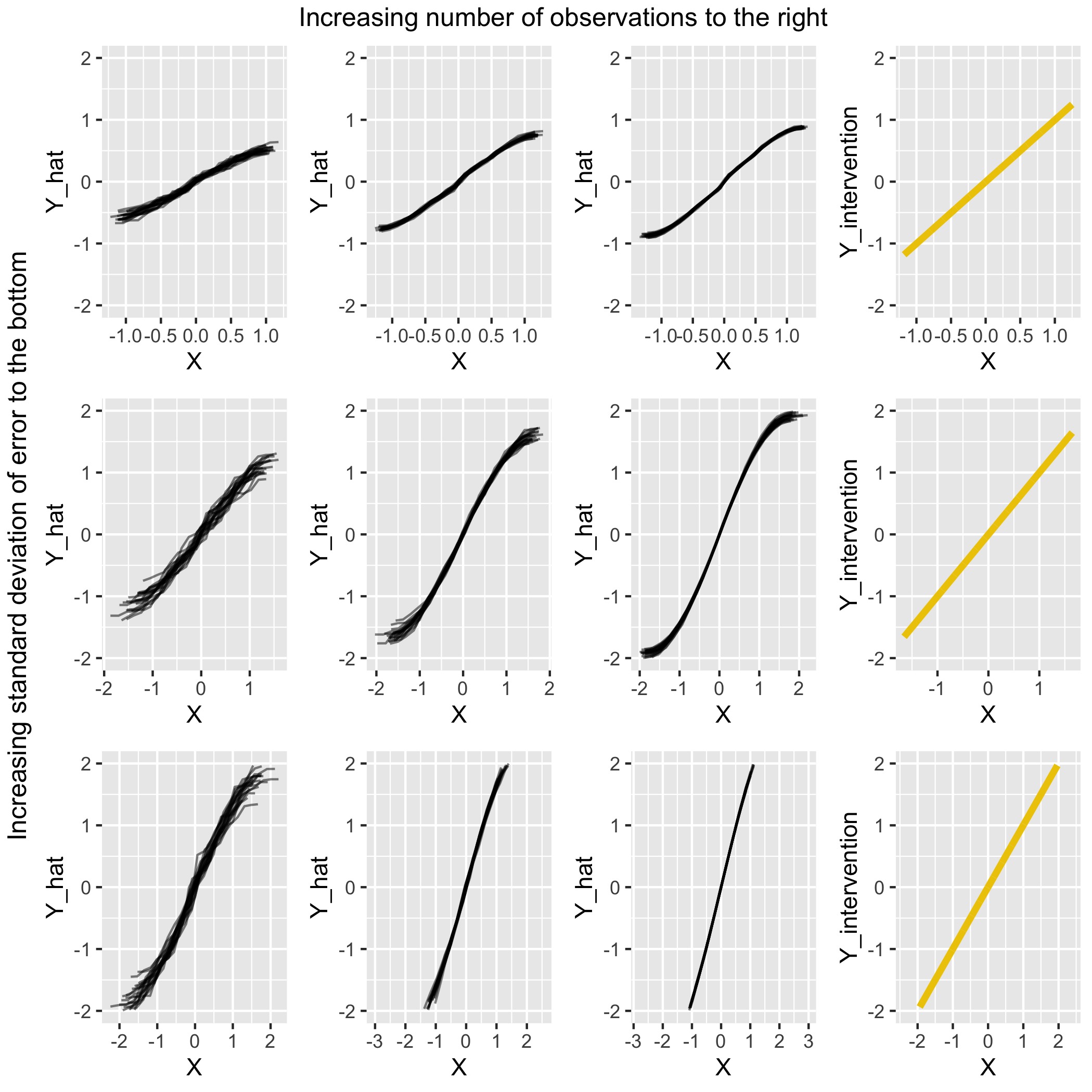
FIGURE 4.4: Comparison for scenario 1 of PDPs under various settings with the (yellow) intervention curve on the right
Overall the PDPs match the intervention curves fairly well. Outside of the extreme regions of \(X\), where some curvature is present, the linear quality of the intervention curve is evident in the PDPs. Furthermore, the scale of \(\hat{Y}\) is comparable to the scale of \(Y_{intervention}\) in most settings.
Scenario 2: Chain DAG

FIGURE 4.5: Chain DAG where X has no a direct impact on Y, but only indirectly through Z
In this scenario the DAG again looks like a chain. \(X\) has an effect on \(Y\) through \(Z\), but no direct relationship between \(X\) and \(Y\) exists. Note that since \(Z\) is a descendant of \(X\), the PDP and intervention curve should not coincide. The initial simulation settings for this scenario are as follows:
\[ Y \leftarrow Z + \epsilon_Y \] \[ \epsilon_Y,\epsilon_Z ~ \sim \mathcal{N}(0, 0.1), \ \ \ \ \ \epsilon_X \sim \mathcal{U}(-1,1), \ \ \ \ \ X \leftarrow \epsilon_X, \ \ \ \ \ Z \leftarrow X + \epsilon_Z, \ \ \ \ \ N \leftarrow 100 \]
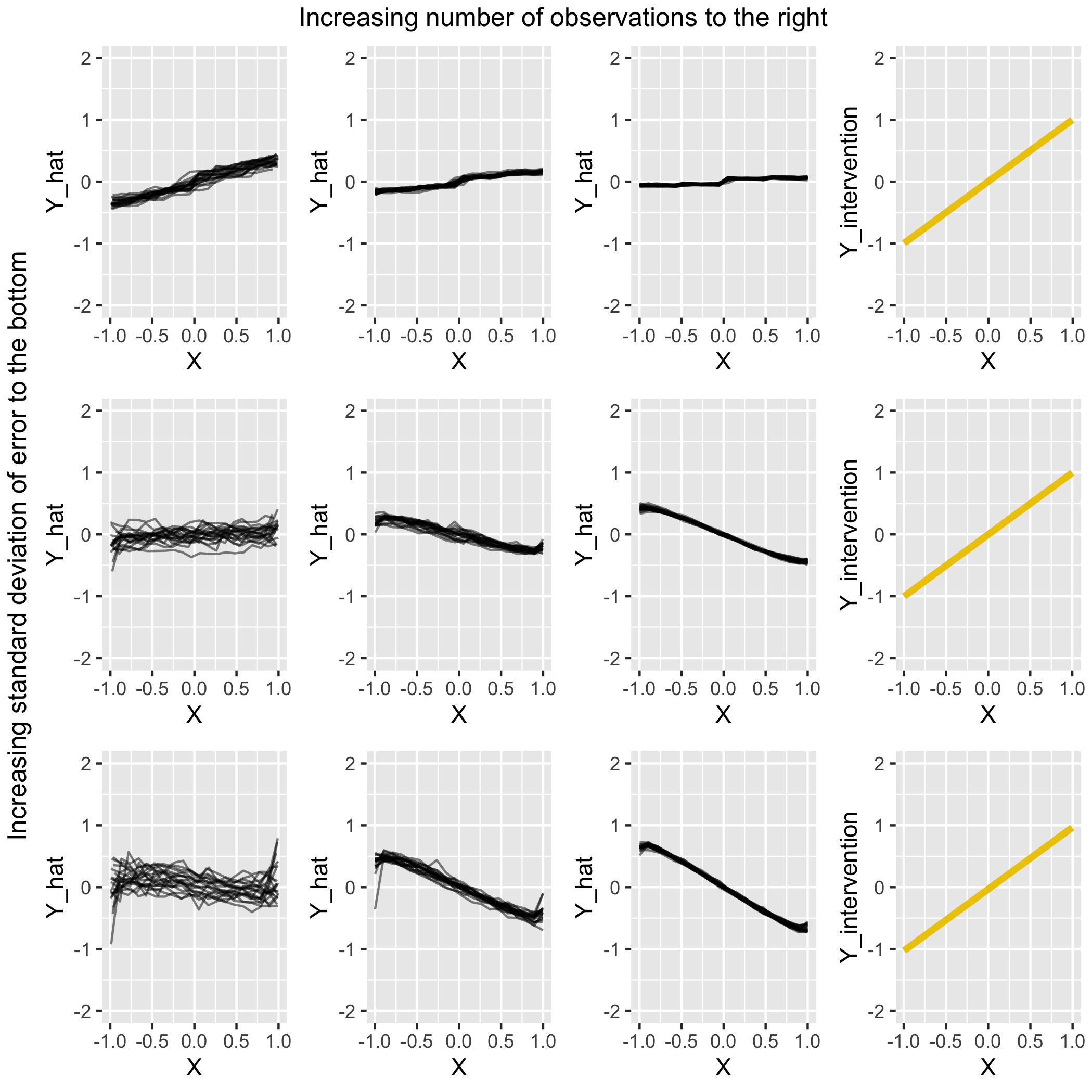
FIGURE 4.6: Comparison for scenario 2 of PDPs under various settings with the (yellow) intervention curve on the right
As can be seen from Figure 4.6, the PDP plots do not match the intervention plots well in several cases. The effect strength is a lot smaller and in fact, four out of nine settings show a negative slope for the relationship between \(X\) and \(Y\) in comparison to the overall positive slope for the true intervention. The first row performs best, as expected due to the relatively small error that is used. Interesting is also that in the second and third row, where the error has been increased, the PDP slope goes from positive to negative between the first and second column. PDP accuracy thus suffers in situations where the observation count is low. In theory, we would expect the slope to be zero. It remains to be investigated why we still see a trend, and why this trend is negative in some cases.
Scenario 3
After two chains, we now have a scenario where \(X\) has an influence on both \(Z\) and \(Y\) directly, as well as \(Z\) having an impact on \(Y\), as seen in Figure 4.7. X confounds \(Z \rightarrow Y\) here. An example of a confounding variable in real life might be for instance the relationship between the level of physical activity and weight gain, which is confounded by age. Age affects both weight gain and the level of physical activity (on average), making it similar to the X in our scenario here. This scenario is similar to the previous one with only an edge between \(X\) and \(Y\) having been added. As can be seen from the DAG in 4.7, \(Z\) is still a descendant of \(X\). As the backdoor criterion is not met, we cannot expect a causal interpretation to be valid.

FIGURE 4.7: X is a confounding variable impacting both Z and Y
The similarity to the previous scenario can also be noted in the simulation settings, where the only difference is the addition of \(X\) to the equation for \(Y\).
\[ Y \leftarrow Z + X + \epsilon_Y \] \[ \epsilon_Y,\epsilon_Z ~ \sim \mathcal{N}(0, 0.1), \ \ \ \ \ \epsilon_X \sim \mathcal{U}(-1,1), \ \ \ \ \ X \leftarrow \epsilon_X, \ \ \ \ \ Z \leftarrow X + \epsilon_Z, \ \ \ \ \ N \leftarrow 100 \]
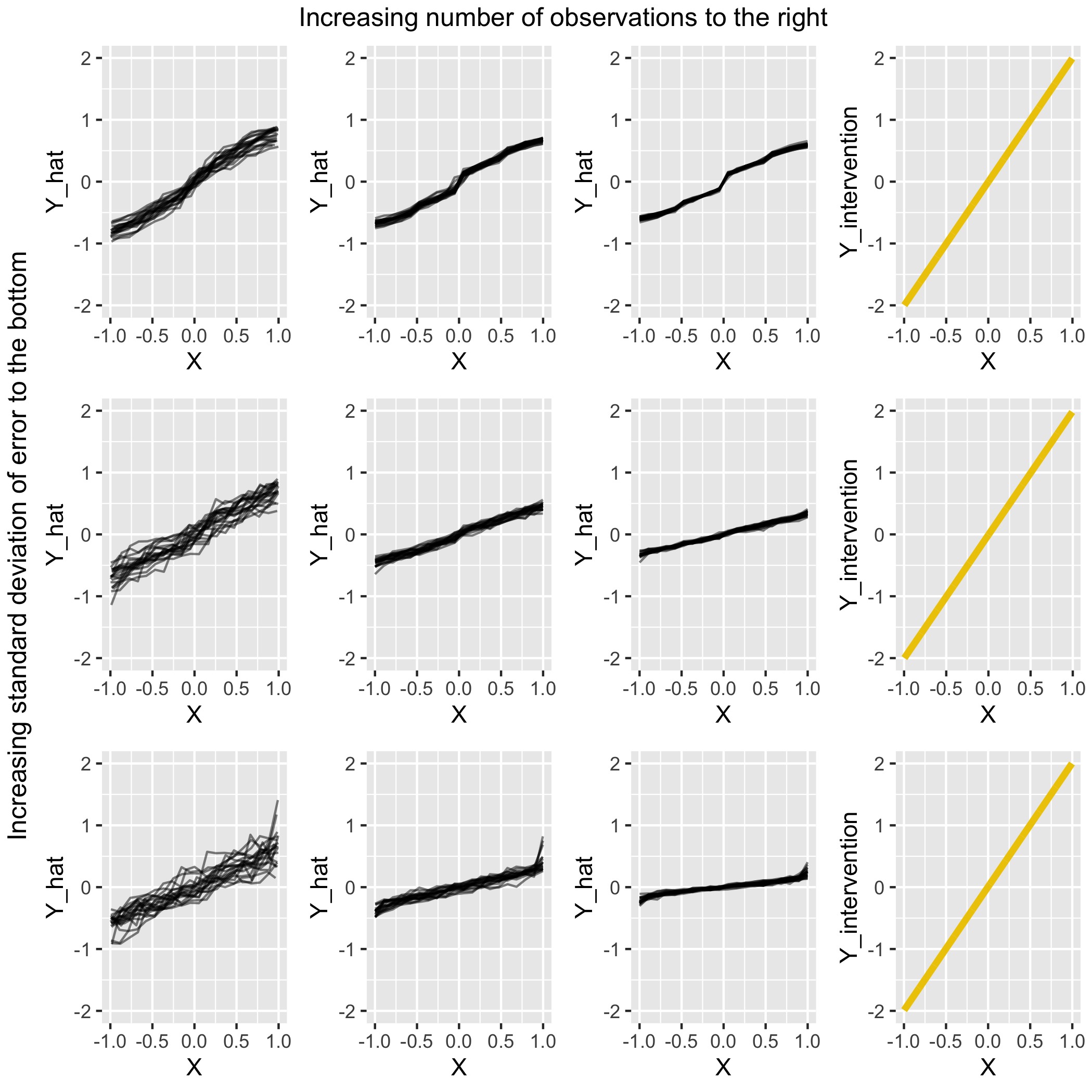
FIGURE 4.8: Comparison for scenario 3 of PDPs under various settings with the (yellow) intervention curve on the right
The expectation was that the PDP would not show the same results as the true intervention. On first glance in Figure 4.8, the PDPs do not seem to be as inaccurate as they were in scenario 2. An overall upward trend seen in the true intervention on the right is also captured by the PDPs in all settings. However, big differences do exist. First of all, the scale of \(\hat{Y}\) is off in every setting. This issue gets worse both when the standard deviation of the error increases and when the number of observations is increased. The worst setting is the bottom right, where \(N = 10.000\) and the standard deviation of the error is 0.5. The range of \(\hat{Y}\) is very small compared to the true intervention next to it and the slope is not steep enough. In fact, the correct slope can only be seen in a very few points: In the top row plot 2 and 3 around \(X=0\) and on the second row plot 3, also around \(X=0\). Overall the result is not as poor as in scenario 2, but a causal interpretation of these plots would lead to a severe underestimation of the impact \(X\) has on \(Y\).
Scenario 4
Scenario 4 consists of a direct effect of \(X\) on \(Y\). \(Z\) meanwhile is unrelated to both \(X\) and \(Y\). It is however included in the simulation and included in the model that is run to create the PDPs. In a non-simulated setting, \(Z\) can be seen as a variable that we assume might be related to \(Y\) and therefore include, but in actuality has nothing to do with the causal process and should not be included. We will see now how the PDP deals with this kind of variable in the mix.
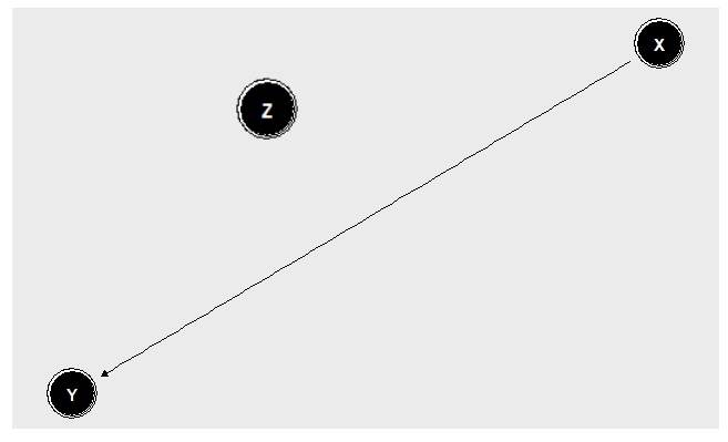
FIGURE 4.9: X directly impacts Y. Z is included in our model, but has no relationship to X or Y
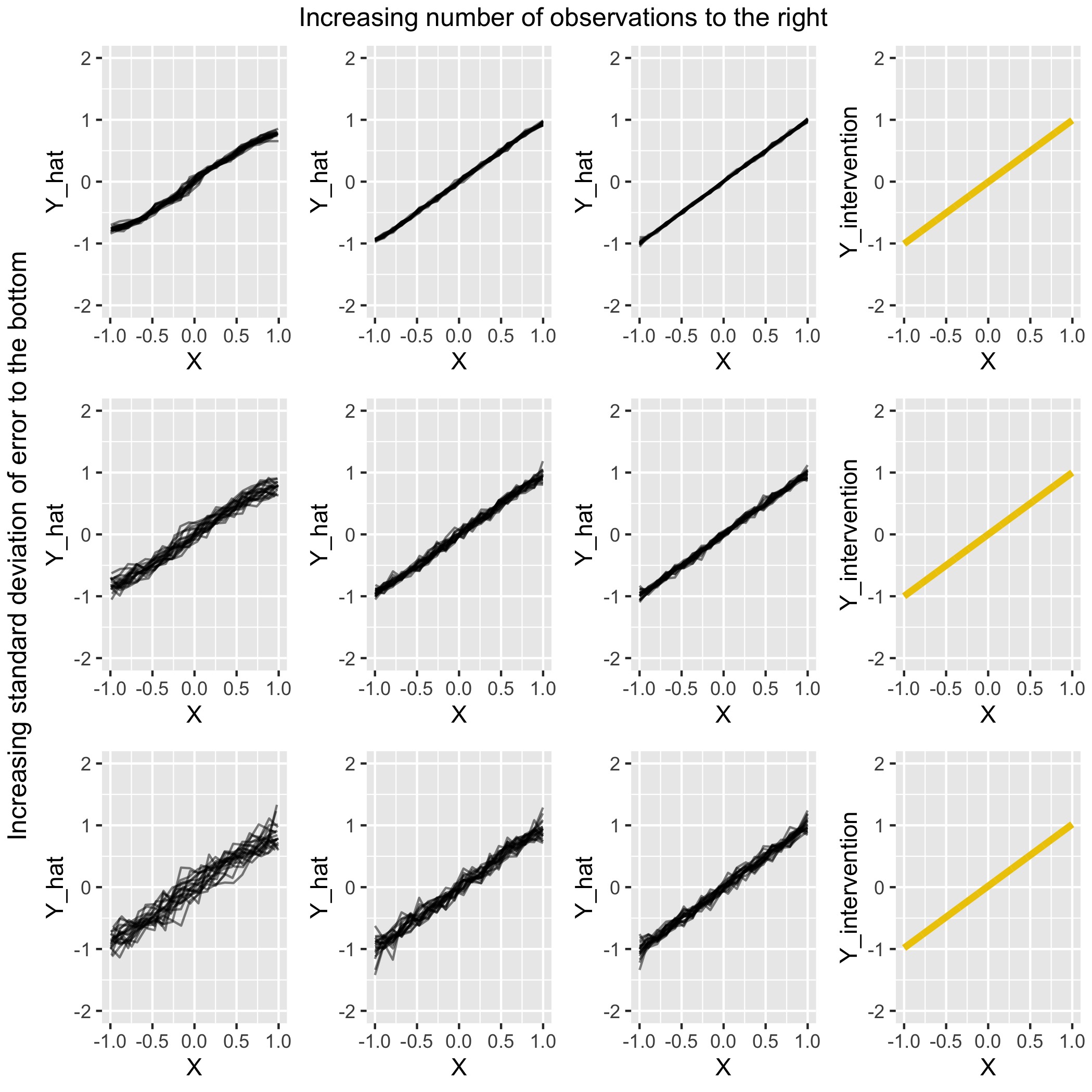
FIGURE 4.10: Comparison for scenario 4 of PDPs under various settings with the (yellow) intervention curve on the right
The PDPs in Figure 4.10 are able to capture the intervention curve well. Only in the cases where \(N=100\) is there slight curvature at the extreme ends of \(X\). With this low number of observations the model is less accurate. In all other settings a consistent slope is present from \(X = -1\) to \(X = 1\), with the scale of \(\hat{Y}\) matching that of \(Y_{intervention}\).
Scenario 5
In this scenario Z is a confounding variable. This is similar to scenario 3 where \(X\) was the confounder. Thinking back to the example of age being a confounding variable for level of physical activity and weight gain, in the previous example our \(X\) was comparable to the confounder age. In this scenario, we can keep the same example, but say our variable \(X\) is now comparable to the variable level of physical activity that is being confounded. Since \(X\) has no descendants and there is no backdoor path, the expectation here is that the PDPs will be similar to the intervention curve.

FIGURE 4.11: Z is a confounding variable impacting both X and Y
The following simulation settings were used:
\[ Y \leftarrow Z + X + \epsilon_Y \] \[ \epsilon_Y,\epsilon_X ~ \sim \mathcal{N}(0, 0.1), \ \ \ \ \ \epsilon_Z \sim \mathcal{U}(-1,1), \ \ \ \ \ Z \leftarrow \epsilon_Z, \ \ \ \ \ X \leftarrow Z + \epsilon_X, \ \ \ \ \ N \leftarrow 100 \]
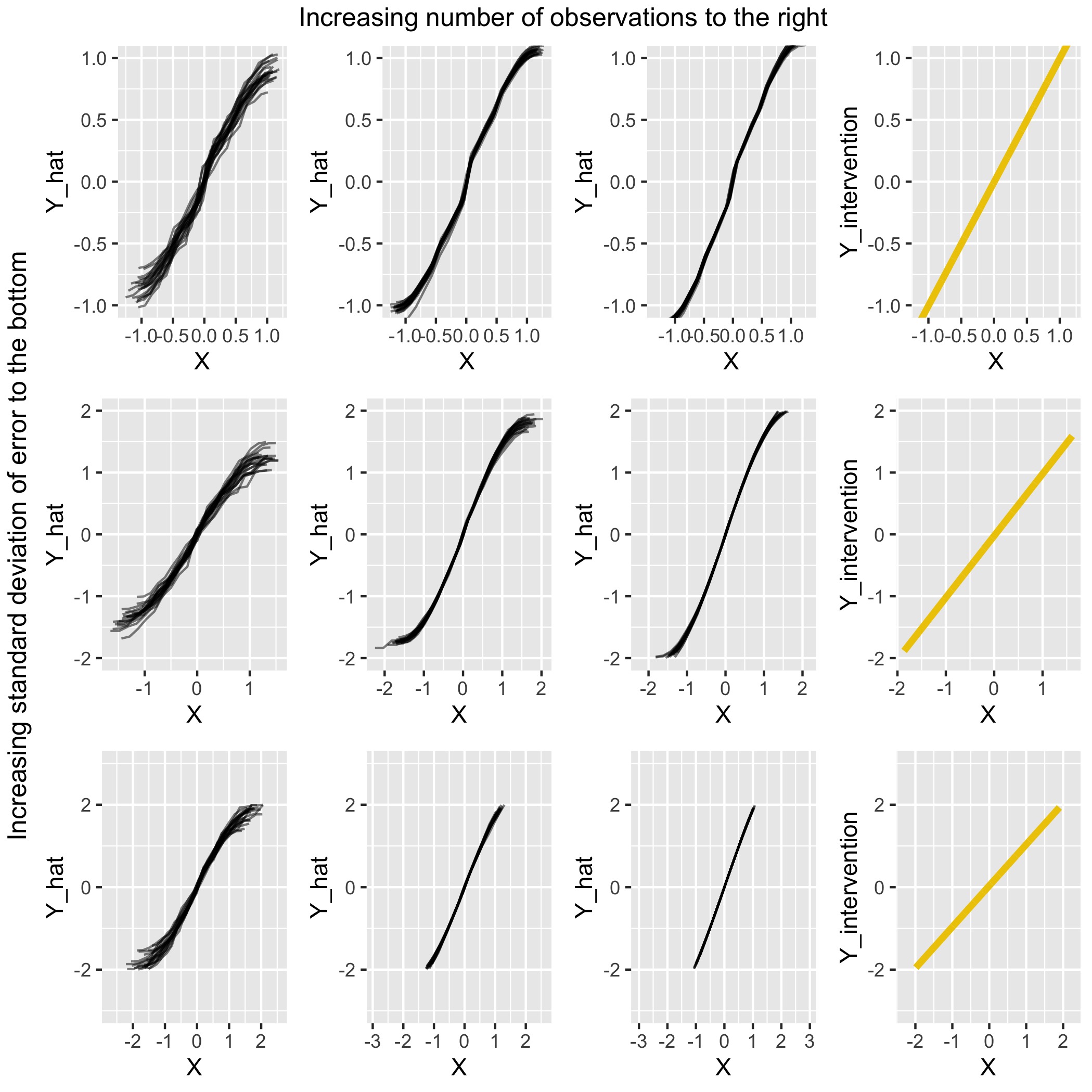
FIGURE 4.12: Comparison for scenario 5 of PDPs under various settings with the (yellow) intervention curve on the right
We can see in Figure 4.12 that aside from the extreme regions of \(X\) where the slope is flatter, the PDPs are fairly similar to the Intervention Curves on the right. We can see that as the standard deviations of the errors increase, so does the range of \(Y_intervention\) from (-1, 1) to (-2,2). This same trend can be observed in the PDPs. As could be expected, the PDPs with the highest number of observations are are most accurate and have the lowest standard deviation of errors.
4.5 Conclusion
Causal interpretability of a PDP is dependent on several things: (1) The backdoor criterion being met. We have seen that if the backdoor criterion is met, meaning no variable in the complement set \(C\) is a descendant of our variable of interest, the PDP should be the same as the intervention curve. We say should, because in practice it will also depend on: (2) The model fit. Even when the backdoor criterion is met, the PDP might not fully capture the exact same relationship as the intervention curve. Especially in extreme regions, where data is potentially sparse, the PDP can be deceptive. Same in scenarios with a higher(er) error and low number of observations.
Point (2) can be estimated with the standard goodness of fit measures that are pervasive in the statistics literature. It may be noted that models may show a good fit, but do not learn the patterns that we would expect them to learn from a theoretical point of view. Point (1) is even more difficult to verify, especially based on only the data. Here a certain amount of domain knowledge is needed to ensure the assumption is met. Still, it is a hard assumption to verify which could limit the confidence people have in a causal interpretation of a PDP. In the two variables case we may already have difficulty finding a causal interpretation. As we saw with the ice-cream example, the direction of the dependency already makes a large difference. In many cases, the necessary domain knowledge may be hard to attain.
References
Pearl, Judea. 1993. “Comment: Graphical Models, Causality and Intervention.” Statistical Science 8 (3): 266–69.
Scholbeck, Christian. 2018. “Interpretierbares Machine-Learning. Post-Hoc Modellagnostische Verfahren Zur Bestimmung von Prädiktoreffekten in Supervised-Learning-Modellen.” Ludwig-Maximilians-Universität München.
Zhao, Qingyuan, and Trevor Hastie. 2018. Causal Interpretations of Black-Box Models. http://web.stanford.edu/~hastie/Papers/pdp_zhao_final.pdf.