Model predictions
model.RmdThe as_visualizer() function automatically creates
appropriate visualizers for model predictions on tasks with one or two
features. By default, it uses ggplot2 for 1D and 2D
visualizations. For 2D tasks, you can optionally specify
type = "surface" to get interactive plotly
surface plots.
Prediction surfaces
Let’s start with the california_housing data set. The
goal is to predict the median house value for California districts. We
subset the data set to only use the features median_income
and housing_median_age, and sample 2000 observations for
faster rendering. The median_income feature is the median
income in block group and housing_median_age is the median
age of a house within a block.
task_housing = tsk("california_housing")
task_housing$select(c("median_income", "housing_median_age"))
task_housing$filter(rows = sample(task_housing$nrow, 2000))
We load the support vector machine learner for regression.
learner = lrn("regr.svm")Now we create a visualizer object, using the plotly
backend (type = "surface").
vis = as_visualizer(task_housing, learner = learner, type = "surface")By default as_visualizer() (re)trains the supplied
learner on the task. If you already trained the learner and just want to
visualize it, set retrain = FALSE to reuse the fitted
model. It then creates a grid for the two features, computes predictions
for each grid point, and renders an interactive surface plot.
vis$plot()Add contour lines on the surface.
vis$add_contours()$plot()We can add the training points to the plot using method chaining.
vis$add_training_data()$plot()We can also flatten the surface to arrive at a 2D contour plot by
using the flatten = TRUE parameter.
vis$plot(flatten = TRUE)To switch back to the surface plot, simply use
flatten = FALSE (or omit the parameter since it’s the
default).
Classification tasks
It is also possible to visualize classification tasks. We use the
pima data set and impute the missing values. We select the
features insulin and mass and train a support
vector machine for classification.
task = tsk("pima")
task = po("imputemean")$train(list(task))[[1]]
task$select(c("insulin", "mass"))
learner = lrn("classif.svm", predict_type = "prob")
We create a visualizer object, using the default ggplot2
backend, and plot the predictions.
vis = as_visualizer(task, learner = learner)
vis$plot()
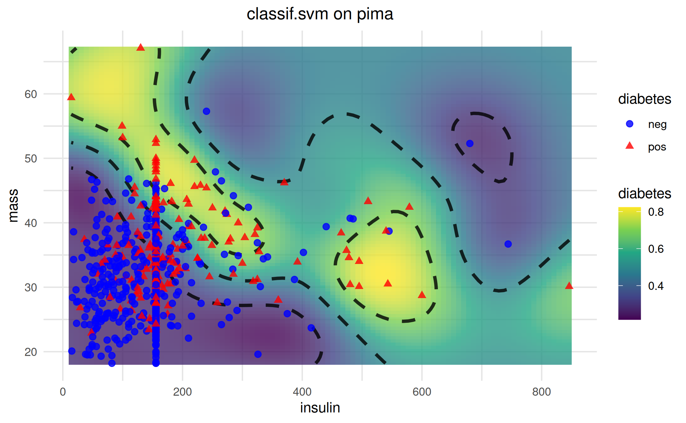
We can add (potential) decision boundaries to the plot using method chaining.
vis$add_boundary(values = c(0.3, 0.5, 0.7))$plot()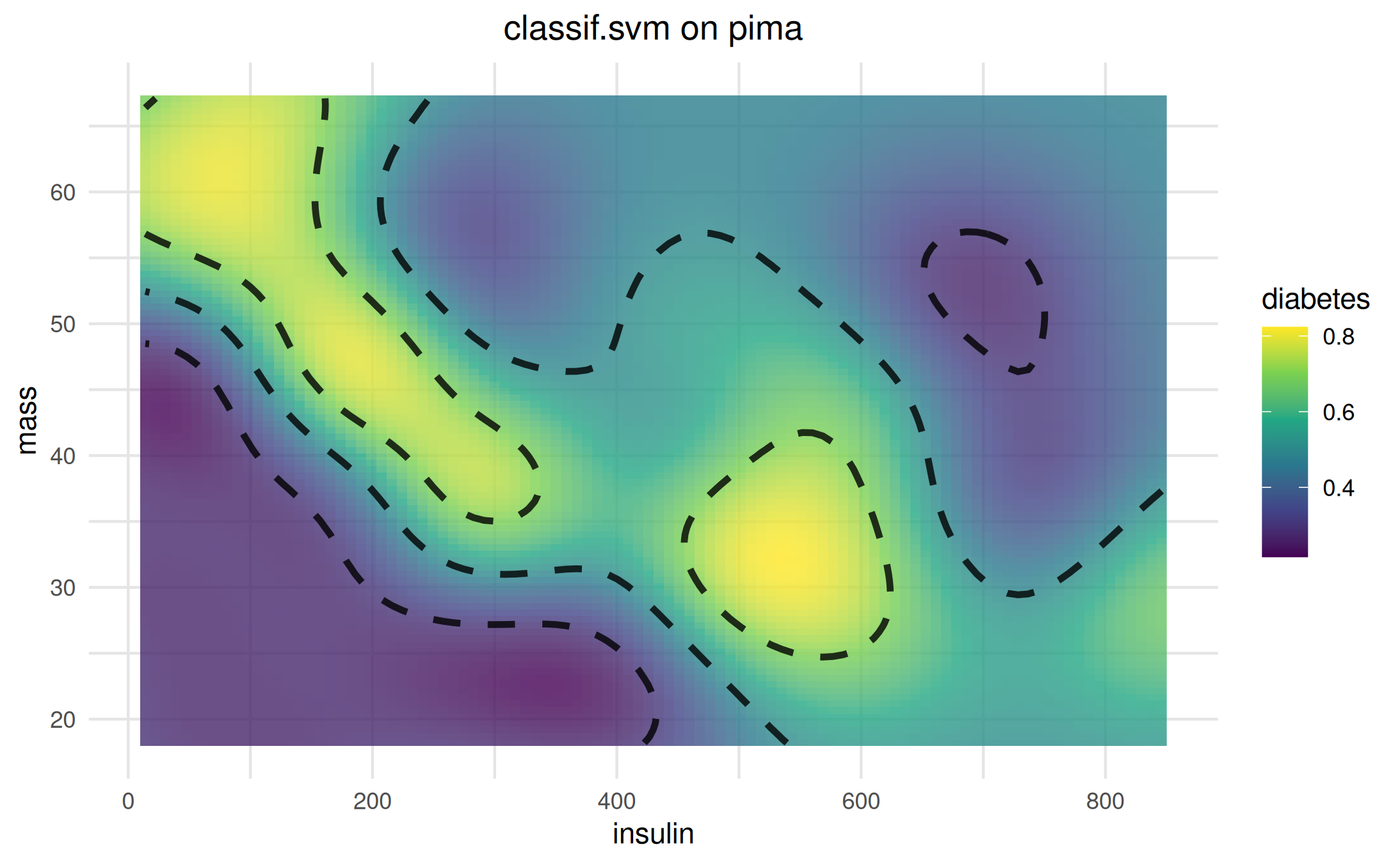
For classification tasks, add_training_data() supports
setting different colors and shapes for the different classes.
Hypothesis-only visualization
You can visualize simple functional hypotheses without a Task/Learner
by providing a Hypothesis and a plotting domain.
pi_fun = function(x, y) 0.7 * x + 0.2 * y + 4
hyp = hypothesis(pi_fun, type = "classif", predictors = c("x", "y"), link = "logit", domain = list(x = c(-3, 3), y = c(-3, 3)))
as_visualizer(hyp, type = "surface", domain = hyp$domain)$plot()
You can also skip training a learner and visualize a hand-crafted hypothesis directly on a real 2D task. Below, we return to the California Housing task with two features and define a simple regression hypothesis over those features, then render it as an interactive surface.
fun = function(median_income, housing_median_age) {
  60000 + 80000 * plogis(1.5 * median_income - 0.03 * housing_median_age)
}
hyp_housing = hypothesis(
  fun = fun,
  type = "regr",
  predictors = c("median_income", "housing_median_age")
)

vis_hsurf = as_visualizer(task_housing, hypothesis = hyp_housing, type = "surface")
vis_hsurf$add_training_data()
vis_hsurf$plot(z_limits = range(vis_hsurf$zmat, na.rm = TRUE))
Adding custom points
You can add arbitrary points to a model visualization using
add_points(). When you supply both x and y values you may
also request geometric loss visualization (for 1D regression only):
-
loss = "l2_se": draws a square whose vertical side equals the absolute residual and a vertical residual segment. -
loss = "l1_ae": draws only the vertical residual segment.
Below we create a 1D regression task (single feature) and add three custom points with L2 squared-error geometry.
# Create target y = 2x + 1 with small noise
dt = data.table::data.table(x = seq(-1, 1, length.out = 11))
dt[, `:=`(y = 2 * x + 1)]
task = mlr3::TaskRegr$new(id = "lin", backend = dt, target = "y")
learner = mlr3::lrn("regr.lm")
vis = as_visualizer(task, learner = learner)
# Points purposely off the line to create residuals
pts = data.frame(x = c(-0.5, 0, 0.75), y = c(2.2, 1.1, 2.4))
vis$add_points(pts, loss = "l2_se")$plot()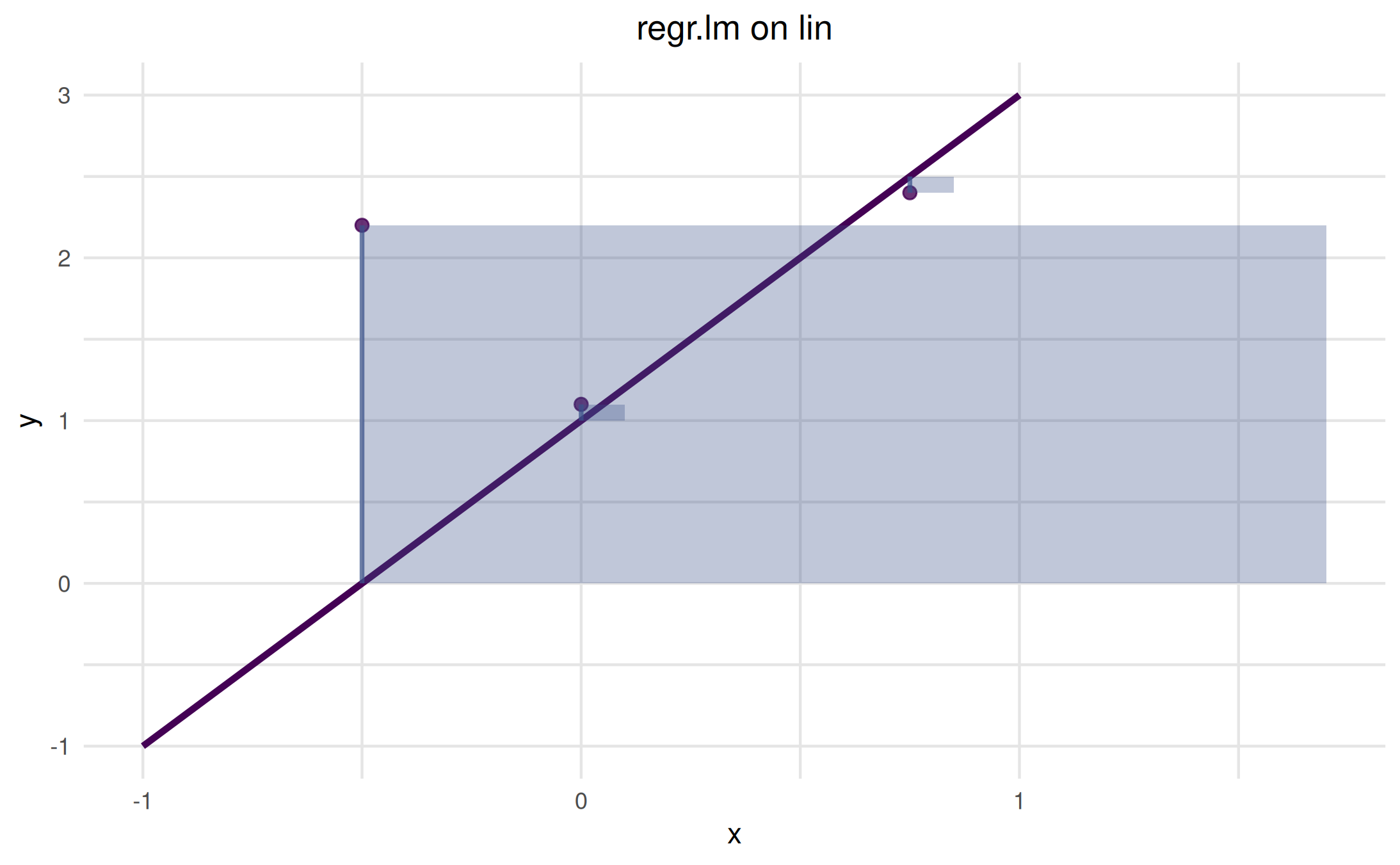
The translucent squares represent the squared error areas; the
vertical segments show absolute residuals. Use loss = "l1"
to only draw residual segments.